Craft · Sound · Bharat · Sep 2026
Sensibilities
The function is why you install it. The rest is why you trust it.
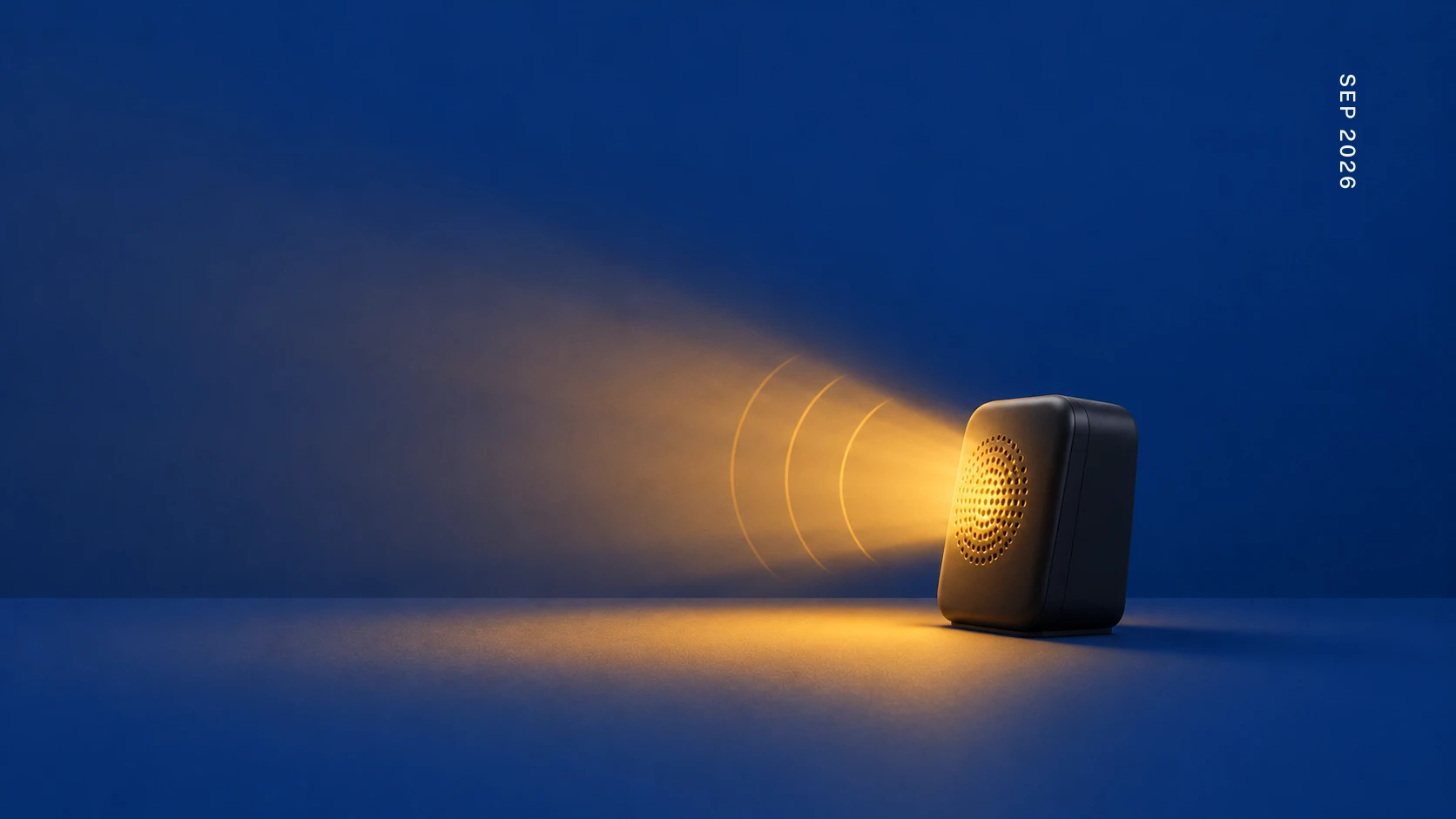
A shopkeeper in a small town takes a UPI payment. He doesn't look at his phone. A little box on the counter says, out loud, in his language, that fifty rupees came in. He nods and turns to the next customer.
Nothing about that box moves the money. The payment already worked. The box exists so he never has to wonder. That's a sensibility: the part of a product that isn't the job, and tells you someone thought about your day.
It cuts both ways. The shopkeeper wants it loud. The person paying might not. Now the whole queue knows what you spent. Walk into a five-star hotel or a big showroom: no box. Nobody announces what you paid. They've made the other call, on purpose. Same sound, two different answers. Sensibilities aren't a coat of polish. They're decisions about people, and every one has a cost.
The writer Scott Berkun has a plain line for this: good depends on context. Nothing is good or bad on its own. The box is right for the shopkeeper and wrong for the person standing in line. Before you decide how a product should feel, ask who is standing there when it speaks.
Every product carries three of them, whether anyone designed them or not.
- 01How it looks. Not decoration. Calm or shouty. Type set for someone reading in sunlight on a bus. People decide in a second whether a thing was made with care. They don't say it. They just pick the one that was.
- 02How it sounds, and how it feels in the hand. Car makers tune the sound of a door closing. A thin click makes the whole car feel cheap. Electric cars got so quiet that regulators made them add a sound at low speed, for the people who couldn't hear them coming. Dieter Rams tuned the click of a Braun switch until your finger knew the job was done. Nintendo tunes the buzz inside its controllers so finely that a glass of ice in a game feels like ice. A payment app's confirmation tone does the same job as the box on the counter. Silence is a decision too. Usually the wrong one.
- 03How it approaches you. The first screen. Whether it asks for your number before it has done anything for you. Duolingo greets you like a friend who noticed you were gone, not like a form with a deadline. The tone of a product is a sensibility, and most products let it happen by accident.
A closer look at how it looks.
My son was four. We drove past a hoarding with no name and no words on it, just one big field of a very specific orange. He said the brand's name out loud. He couldn't read yet. The colour was enough. A brand isn't a logo. It's a habit the eye learns, and colour is the fastest way in, because nobody guards that door. Hold the same colour, in the same place, for long enough, and it stops being information and starts being the surroundings. The goal isn't to be seen. It's to be remembered.
Open an AI design tool and ask for a homepage. You get white space, soft greys and thin buttons. It looks made for an apartment in San Francisco. For many of the users I've sat with, it's the wrong picture. Think of a pan shop, a train departure board, a wedding invitation. Every inch carries something. Nothing is wasted. On an entry-level phone with many apps fighting for one small screen, empty space isn't calm. It's lost signal. And warmth does a job that grey can't, because for these users warmth is often what says the place can be trusted. The tool's default is somebody else's taste. Use it without thinking and you've still made a choice.
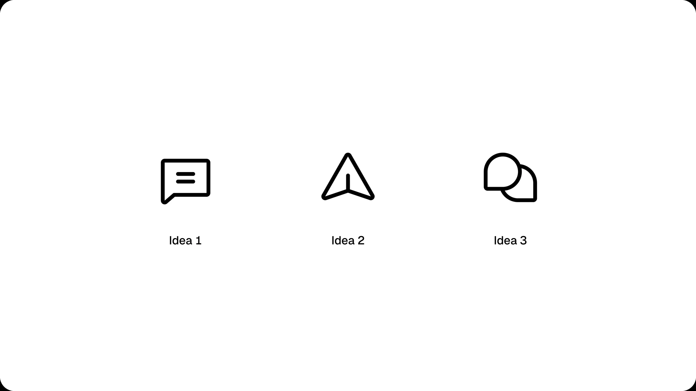
We once had to pick an icon for direct messages. Three options: a single speech bubble, a send arrow, a double speech bubble. We showed them to a watchman in Hyderabad, a ghee seller on the street, and two Urban Company workers. The arrow was the problem. One couldn't tell what it was. One saw "send." Two saw "share." Same arrow, three meanings. The double bubble read as messages, or WhatsApp, or comments, to every one of them. We shipped it. Not because it was prettier. Because everyone read conversation in it, whether they called it messages, WhatsApp, or comments.
Delight isn't a fourth thing you add. It's what people feel when the care is visible and they didn't have to look for it.
One honest caveat from our own user research: people told us the design is why they chose the product, not why they stayed. Sensibilities open the door. What's behind it keeps people there.
Before you add a feature, walk through the product once as a stranger. Mark where it stays silent when you needed it to speak, and where it shouts when you wanted quiet. Fix those first. Cheaper than the feature, and people notice it more.
Chase delight directly and you get confetti. Get the sensibilities right and you get the shopkeeper's nod.
Enjoyed the read?