Struggling with a complex user interface and feature discovery, our product faced a high churn rate, losing customers who never registered or engaged with it.
AI/ML Product Design
I led the design of a no-code ML platform, targeting Business owners and enterprises. This included establishing and growing the design function, redesigning the product and helping the company grow its clientele through a user-focused approach.
Challenge
Solution
Crafted a solution in just 4 weeks: Revamped platform home page and navigation, establishing a clear information hierarchy for each feature. Integrated Hotjar for real-time usage tracking, ensuring continuous relevance and usefulness amid ongoing feature additions.

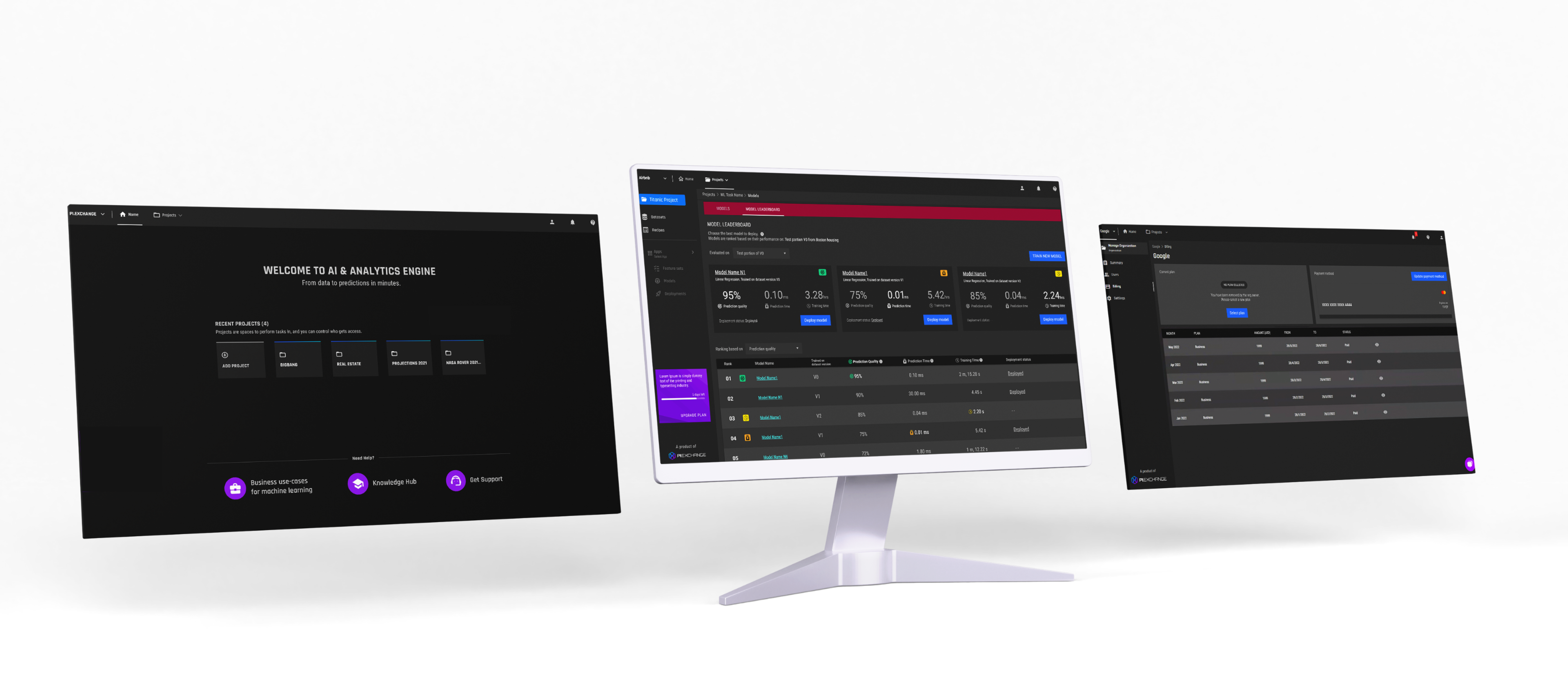
About the Product

Stakeholder Observations
When I first started working on this project, I did stakeholder interviews with a team of Data scientists, project manager, developers and designers and learned that the product needed some major enhancements, if we are aiming to build a no-code ML platform.
Overall communication in the product needs to be enhanced.
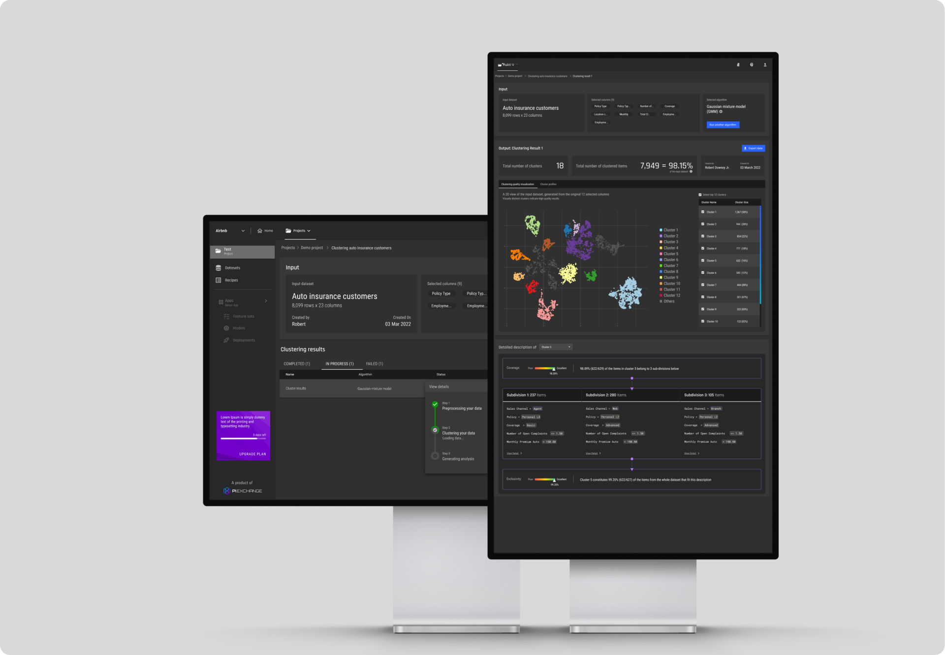
For example, there are some terms that are not explained, such as “train/test” or Clustering.
Visual language should be improved
It’s not clear what color coding means in each feature of the product and it’s not adding much value to user’s understanding of the product.
Improve error handling by adding appropriate CTA or Feedback mechanisms
For example, It would be nice if there was a button for redoing failed deployments when they fail without explanation.
Understand the needs of our customers
During user research, the project manager and I conducted one-on-one interviews with potential customers and observed their interactions with existing features. We also analyzed competitors to understand industry trends.
Insights
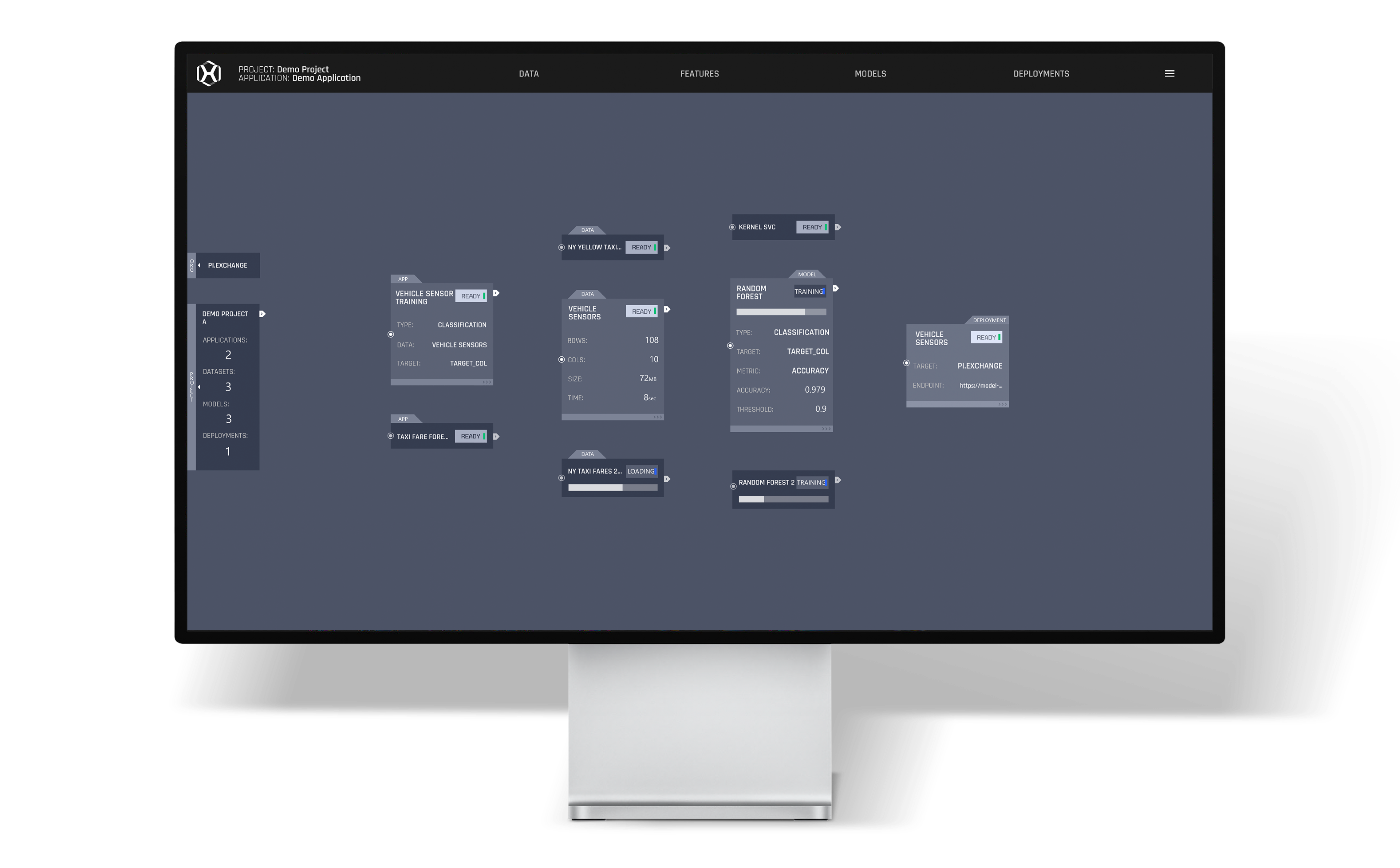
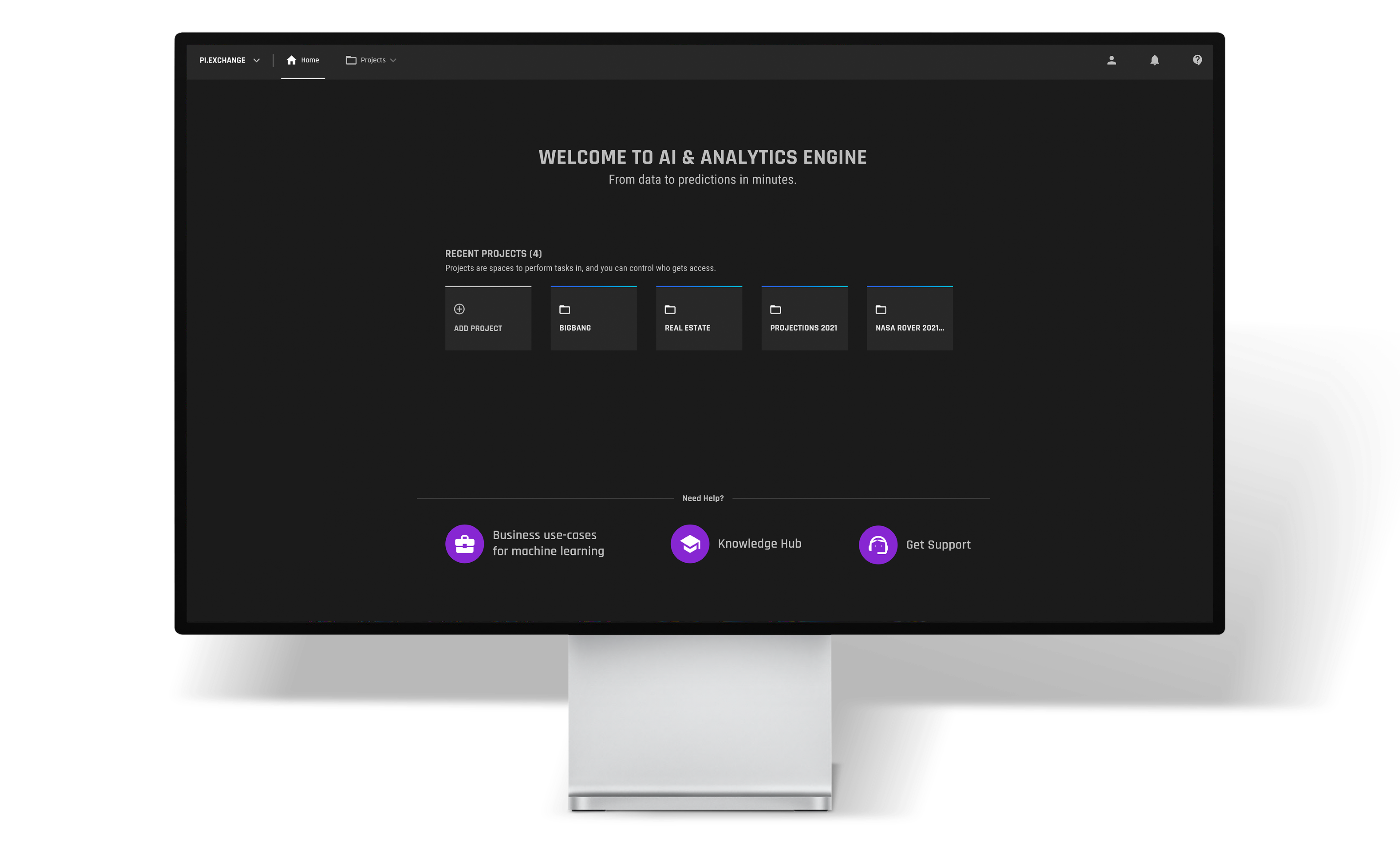
The product’s current homepage was not very intuitive, and did not have an easy way to find what users were looking for.
We noticed that the cards displaying relevant features based on the user’s workflow were not visually appealing and were hard to scan through as you scroll through your workflows.
Mentally exhausting, trying to figure out what to do next constantly.
For many users, choosing a ML model is a complicated process and not sure how to pick, so just picked one randomly.
We noticed that users are unable to proceed quickly from a selected feature, they are looking for some help at the each section of the feature and refereeing to help docs.
Users had no idea how to use the product once they signed up.
Rearranging information to support usability
The main goal of the update was to improve the user experience. We looked at users’ pain points quickly enhanced the information architecture and built the impact and effort matrix to prioritize the features.

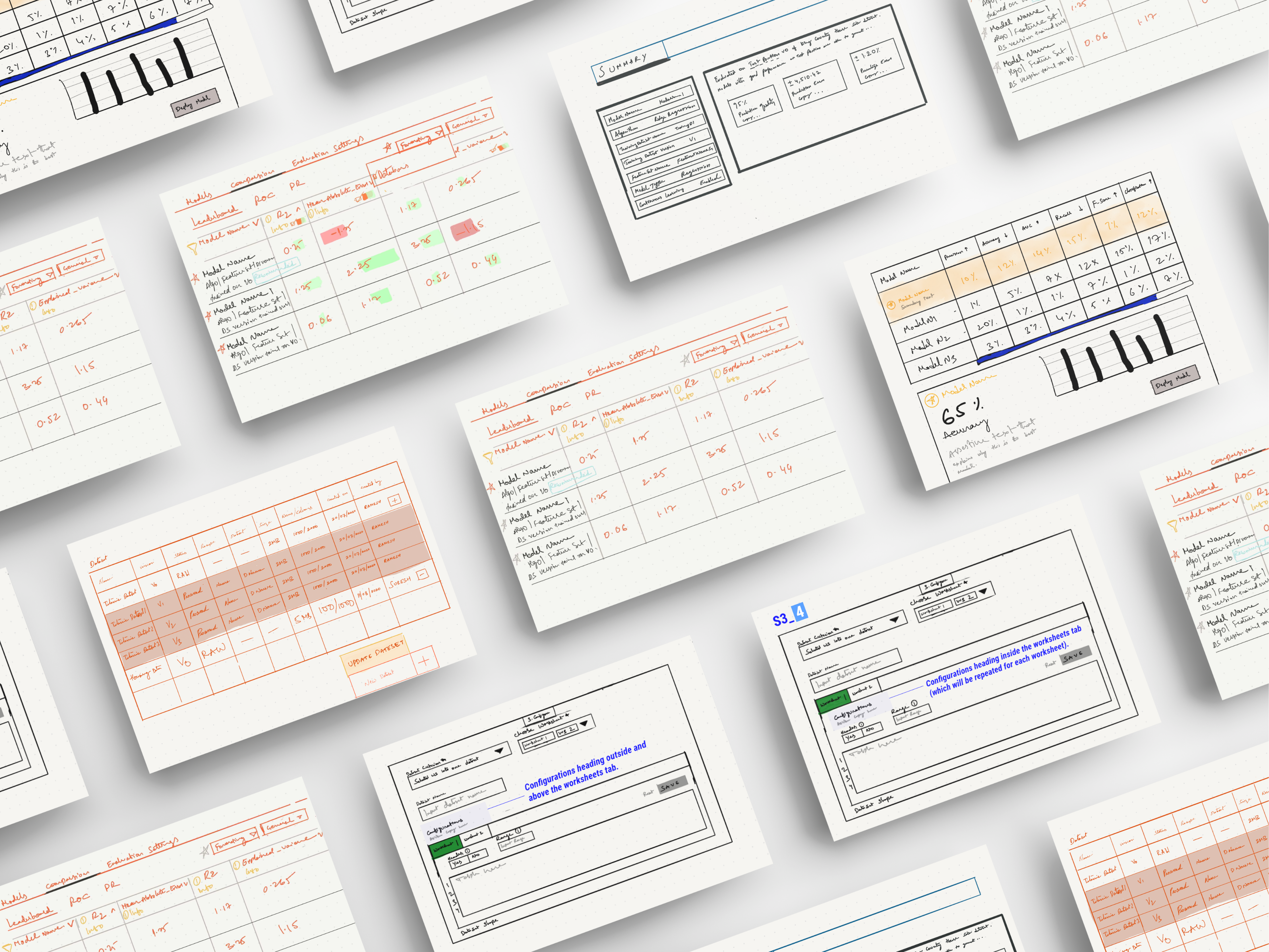
Sketches & Low Fidelity Wireframes
I began by identifying major issues based on the priority, from there, drew rough sketches that included working toward an optimal interface design in collaboration with project managers and data scientists to ensure that our final design worked for all involved parties & espeically users.
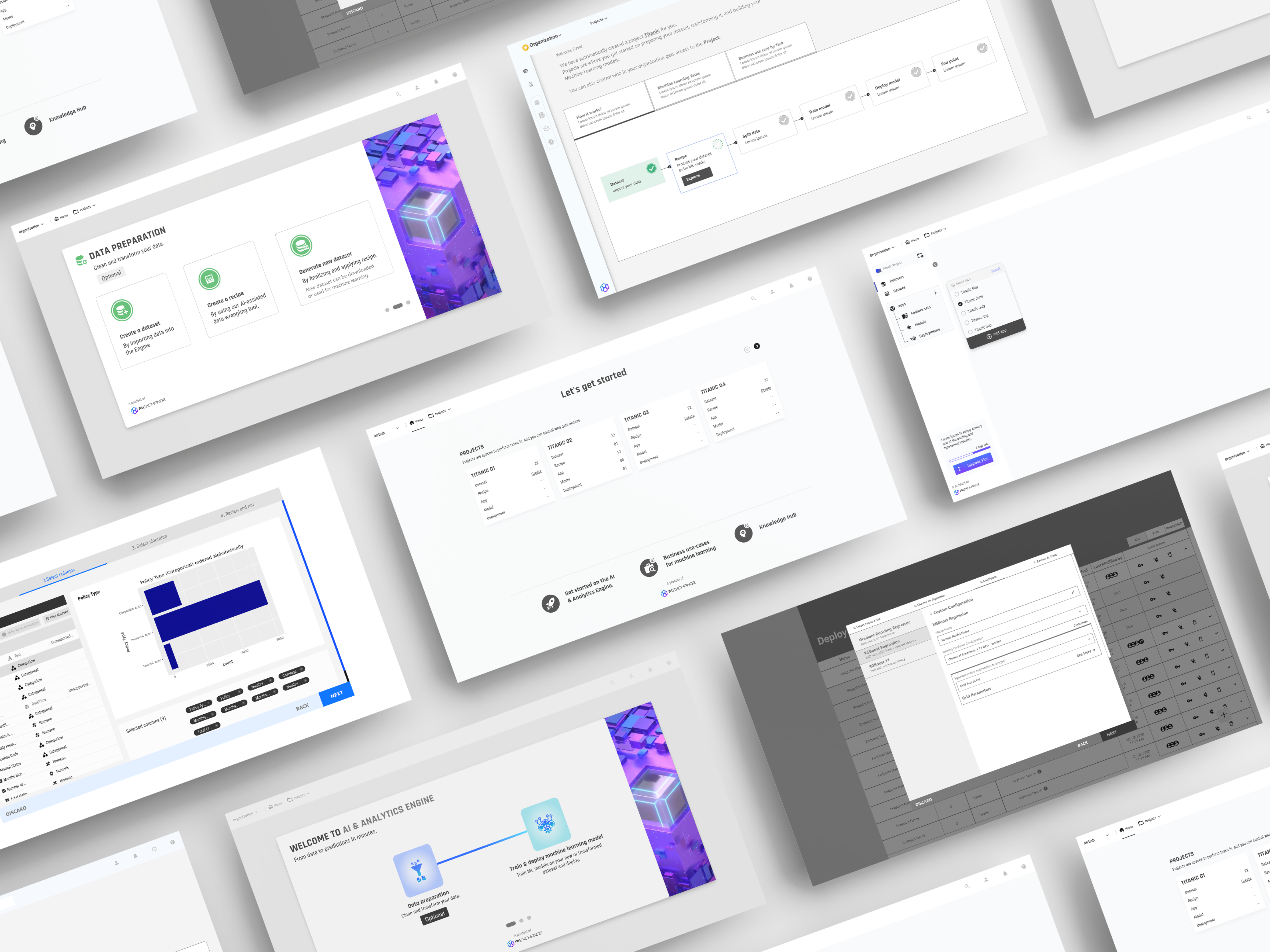

Optimize the user experience
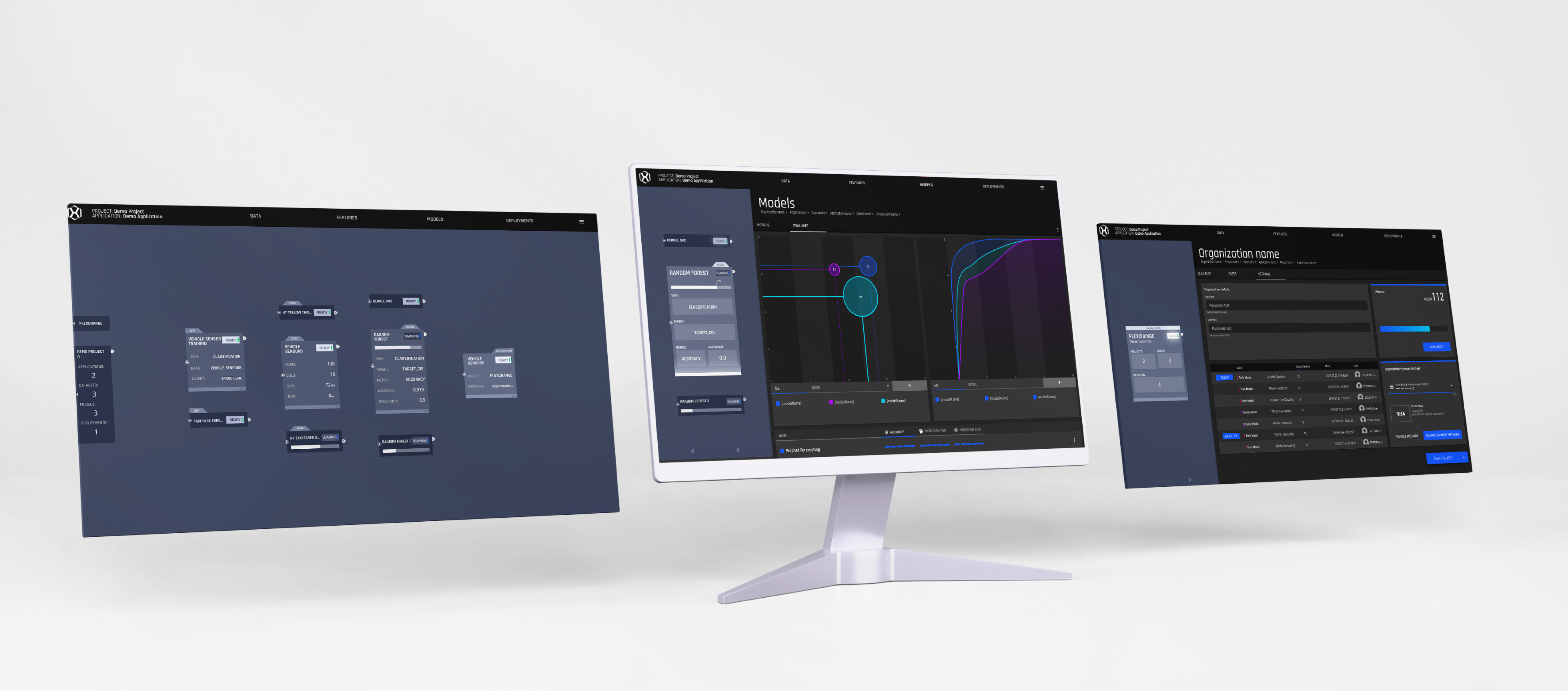
Providing a clear and concise description of what the Apps, models and featureset do and how it works.
The steps in this summary page are optimized to reduce the number of steps required to deploy and consume the results. Optional steps are clearly marked.
Optimized workflow by clear navigation for the user to reach anywhere from any page.
Onboarding cards for the users to understand how the platform helps to quickly deploy the model.
Leading UX in an no code ML platform
Unified PI.EXCHANGE for a better experience, making users happier and more efficient. Learned the strength of designers and data scientists collaborating, emphasizing design sprints for effective teamwork and efficiency lessons for me and my team.
